There is something refreshingly exiting about the way in which the resort collections are being presented in between the major fashion show seasons. There is no grueling 5-week long, never-ending, nonstop, hour-by-hour, minute-by-minute show schedule from one city to another. There is no need to travel half way around the world as most of the resort collections are presented in intimate presentations (predominantly in New York) and disseminated using look-book style imagery.
During the resort presentations, I enjoy visiting style.com not knowing which collections have been released, as each brand determines their own phase unlike during the main shows where the schedules are an exercise in military operation coordinated by fashion councils. The resort collections usually start going into shops at the end of October, and despite being the collection that stays in the shop the longest, they offer much more focused ranges with none of that fashion extravaganza stuff where designers need to put out the ‘statement’ dresses and wacky costumes with over the top styling.
To celebrate the resort presentations method, here is the Address review of Resort 2014, everything but the clothing.
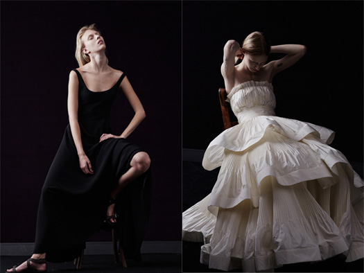
Zac Posen
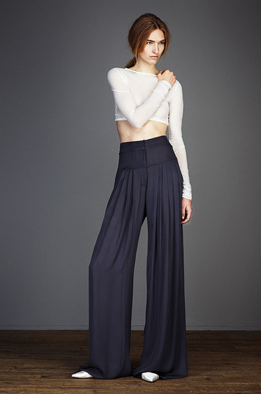
I have never quite been sure what Zac Posen is about as a designer beyond his fondness of eveningwear, which seems to have a specific and no doubt very large market. I do however think that his use of 70’s supermodel Pat Cleveland aged 61, paired up with her daughter Anna, 24, works well for his resort imagery. The choice of models is well considered as both of the Clevelands have a personality with pulling power beyond the obvious celebrity status in the media. I’m not going to launch into a debate about model diversity, but it is refreshing to see a designer attempting to break away from the mold – it could even extend to a unique way for Posen to position his brand going forward. The heavy-handed use of airbrushing looks unfortunate though, and kind of defeats the object. I’ll give it an A-.
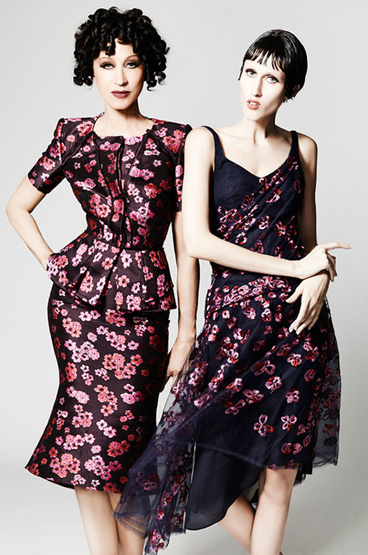
Zac Posen, Resort 2014, Look 12, Source: Style.com
Chloe
Whilst the purpose of resort imagery is to promote the clothing, it doesn’t mean that the backdrop isn’t important. I must admit that I really dislike when fashion shoots are done in unusual locations in the hope of creating something otherworld or unexpected, but I do think that the location used for the Chloe shoot works reasonably well in this instance. The backdrop of what appears to be an old swimming hall is used in three stages – inside the pool (why would you hang around in the bottom of the swimming pool in relatively smart day clothing, I do not understand?), by the pool and somewhere in the lobby possibly. It would be nice to see more clothing pictured in more realistic location instead of dead studio spaces or bizarre places. A– for the attempt.
Chloe, Resort 2014, Look 1, Source: Style.com

Chloe, Resort 2014, Looks 15 & 27, Source: Style.com
Balenciaga
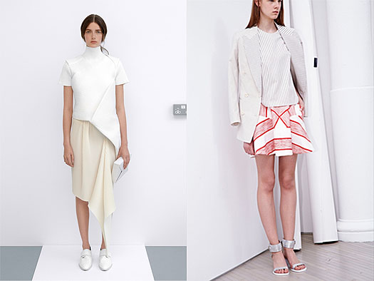
An area where a lot of work needs to be done is the way in which clothing is showcased online. Too much of it is based on flat front views where the side or back is completely disregarded – fashion after all is all about 3-dimentionality. I’m sure the technology, recoding devices and resources exist for fashion brands and media outlets to start to record fashion this way. Thus I appreciate the display methods used at Balenciaga for the resort collection where additional display screens highlight relevant detailing, accessories or back views. I wonder if this could be even further utilised to really underline craft and sell though showcasing detail. I’ll give Balanciaga an A.
Balenciaga, Resort 2014, Look 18, Source: Style.com
Antonio Marras
Antonio Marras’ use of illustration and collage really stands out from all the other resort images as being different, though nothing new. What is really effective about this approach is that it feels relevant to Marras’s overall aesthetics which is delicate, eclectic and multi-layered in terms of referencing and treatments. I can see why an editor would choose to print these over some of the others, as the images just tell a more visually compelling story. Straight A for the collages.

Antonio Marras, Resort 2014, Looks 30 & 37, Source: Style.com
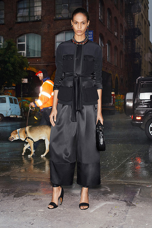
Givenchy
Givenchy is one of the first brands to cultivate a consistent and inspired presentation style for resort imagery. Both the men’s and women’s collections are always shot in New York, either on the streets or in varying mundane locations, a choice that seems fitting with Ricardo Tisci’s fascination with all things American. The occasional runner, dog walker or builder in the background adds humour to the images. What works particularly well is light, as the progression of day to night can be seen in the ambiance. And this of course compliments the standard presentation narrative of collections where daywear is followed by cocktail then eveningwear. Givenchy deserves A* for the light.
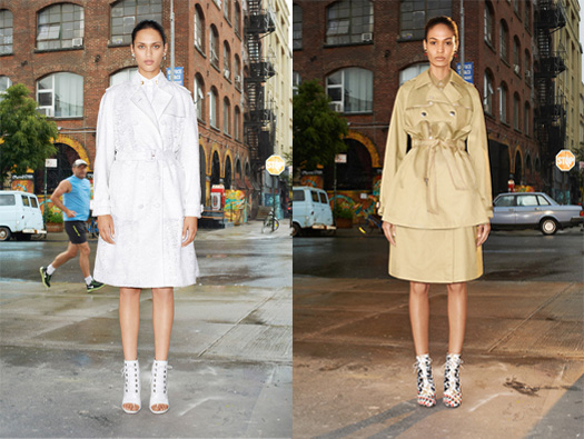
Givenchy, Resort 2014, Looks 2 & 8, Source: Style.com
Givenchy, Resort 2014, Look 23, Source: Style.com
Lanvin
At Lanvin, the artistic bar is a tad higher compared to the rest of the resort photographs as the brand has taken a more editorial approach. This has both strengths and weaknesses: done right and the brand has a set of beautiful images, which will slot into magazines easily and seduce the spectators, done wrong, the result might come across vague and overly stylised. Lanvin has done a bit of both here. It would be an A*, but the vagueness of some of the imagery pulls it down to a straight A.
Lanvin, Resort 2014, Looks 5 & 17, Source: Style.com
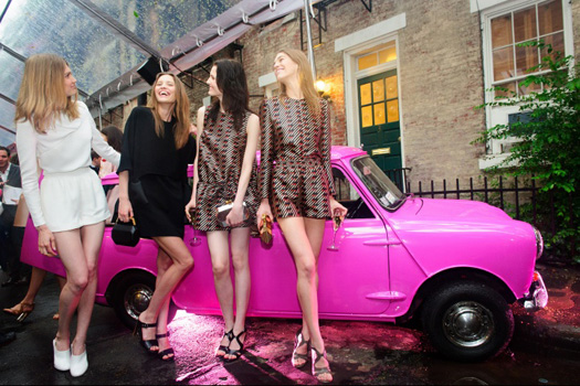
Stella McCartney
It seems like Stella McCartney’s PR and marketing team can put on a good party! For a number of years now, this brand has chosen to showcase the resort along with the pre-fall collections in the form of an informal presentation party. Whether a garden gathering or salon hang-around, this method effectively communicates the attitude of the brand with it’s English references, subtle humour and light-heartedness, and no doubt offers a welcome alternative to dull show settings used during the main season shows. The great thing about this is that the garments come to life in a different way where editors and buyers can interact with the product. A** for the party.
Stella McCartney, Resort 2014, Source: Vogue.com
Stella McCartney, Resort 2014, Source: Vogue.com
Off-Studio
‘Bad’ cropping, unintentional display of the wall behind the backdrop, lighting cables, and other ‘accidents’, this style of photography seems to be the biggest presentation trend this season alongside being rather tiring and uninteresting to look at. It’s disappointing that Stella McCartney can put together a refreshing presentation for the resort but the images that are distributed to buyers and press are so unimaginative. J W Anderson is the worst offender with the most pretentious light switch left in the frame – despite his ability to create some of the most interesting and relevant clothing around at the moment. It’s an F for Fail!
J W Anderson, Resort 2014, Look 10 | 3.1 Phillip Lim, Resort 2014, Look 33, Source: Style.com
Marc by Marc Jacobs, Resort 2014, Look 2 | Stella McCartney, Resort 2014, Look 14, Source: Style.com
Set in a set
Much in the way that the off-studio shooting style seems uninspired, the set in a set approach is ludicrous. I really don’t get the point of this style which is kind of the same when some magazines seem obsessed with putting pictures on top of pictures. This set sandwich seems pointless, another F for Fail!
Jean-Paul Gaultier, Resort 2014, Look 8, Source: Style.com
Fake Catwalk
The fake catwalk style makes me chuckle. This is the format where models are probably asked to walk towards the camera as if they were in a show, which is fine, but it doesn’t work against seamless backdrop a la Donna Karen. At least the Rag and Bone looks more natural in a real set but it doesn’t deserve more than a D-.
Donna Karan, Resort 2014, Look 12 | Rag & Bone, Resort 2014, Look 1, Source: Style.com
No story, So boring
Whilst I’m not advocating that resort shoots should be all jazzy with bells and whistles, I see no point in making them deliberately dull either – the idea is to sell the clothing. I stopped looking at Richard Chai’s collection after look number 2; the presentation was so uninteresting, and this made the clothing look dull as well. It seems that all areas have been completely disregarded from choice of model, pose, atmosphere, attitude, narrative and backdrop. Even the lighting feels dated. Slap on the wrist for Richard Chai and the rest of the designers who went for the easy option. Take note from the good practice listed above. It’s a double Fail for no story boring presentations.
Richard Chai Love, Resort 2014, Look 2, Source: Style.com